
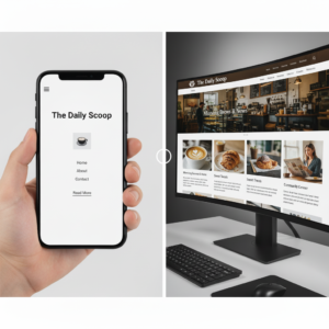
The term mobile-first is used when a website is designed initially with small screen device in mind. Usually this is used when the primary audience is anticipated to be using mobile devices more than desktop machines and allows a focus on cleaner form and faster loading for small screens. However, it doesn’t and shouldn’t prevent the site from being viewed nicely on large screen devices, it just optimises first for mobile. There seems to be a trend developing where this is all that is done, and the larger screens are almost forgotten – what should happen is that the larger screen real-estate should be detected by the website and maximised when possible. This can mean adding additional navigation options such as a menu, or wrapping the screen differently to get more info on display, or using higher resolution images.  But for some this just isn’t done, and the mobile layout is simply made bigger for the larger screens, even preferring to keep the “burger” menu icon that is synonymous with mobile layouts on the larger screen rather than expanding to a full menu.
This can be a saving of development costs, as creating a fully responsive website does incur some additional developer effort, but the result is I think worth it and shouldn’t be underestimated. When a larger format screen is used, adding a full menu makes navigation easier and more enticing to the user. Increasing image resolution when the screen can handle it stops your site from looking like a Ceefax page (how many people remember Ceefax?!). Changing the layout and flow to present more information can avoid additional clicks, and also speed a users consumption of the site. Your visitors/users ultimately determine whether this is worth the effort – a simple shop window site that is fairly static and used primarily as a digital business card may not benefit much. But an online shop with a large catalogue and pages of data will undoubtedly benefit from the extra real-estate of a large screen.
In the short few years that we have had mobile phones capable of surfing the internet we have seen the data surge towards huge uptakes in usage. There’s no doubt that users do use their phones more and more and so mobile-first development makes sense. Depending on your need, your business type, and your audience, the chances are that mobile-first might be the right choice. But should you still consider that larger formats? Should you put the extra effort in to a fully responsive site? That will be a more individual choice that you will need to talk through. Basic responsiveness is a must, and all sites should have at least some responsiveness – the ability to render correctly to any sized screen. What we are talking about here is the additional effort of going above and beyond to give large screens a better experience because of the larger space. A fully responsive site will expand sections, reflow text and images, increase resolutions, unhide hidden elements and add extra ones. Enriching the site for a fuller experience.
There are a number of other factors to consider; accessibility should not be negatively affected by any responsiveness, SEO can prioritise a mobile-first site over a desktop render, and certain functionality can be difficult to reduce to a small screen. In the case of functionality, careful consideration should be given to the quality of experience on a small screen compared to a large screen, it may be that it will work… but will the users enjoy it, or just be frustrated by it. Using the small screen anyway could harm your reputation, and it may be better to just advertise the service on mobile, and encourage the use of a large screen to complete the function. But individual circumstances must determine this. Mobiles also have apps, and it is often preferable to push functionality into an app environment rather than in a mobile website, but this is a separate topic!